
Stoneback appliance
BRAND IDENTITY
The company's logo was due for an upgrade. After discussing the type of logo the client thought would represent them well, KMG presented several concepts. Ultimately, a retro-style logo was chosen, symbolizing Stoneback Appliance's commitment to time-honored methods of dedicated customer service and celebrating their presence as a longtime staple of the community.
Before
After
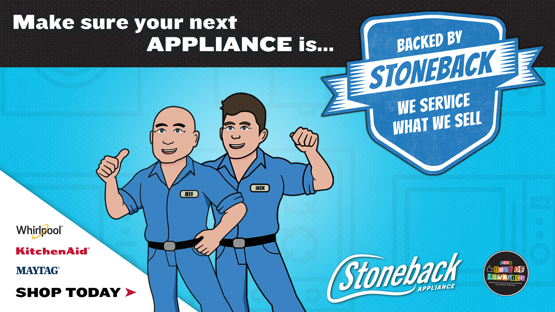
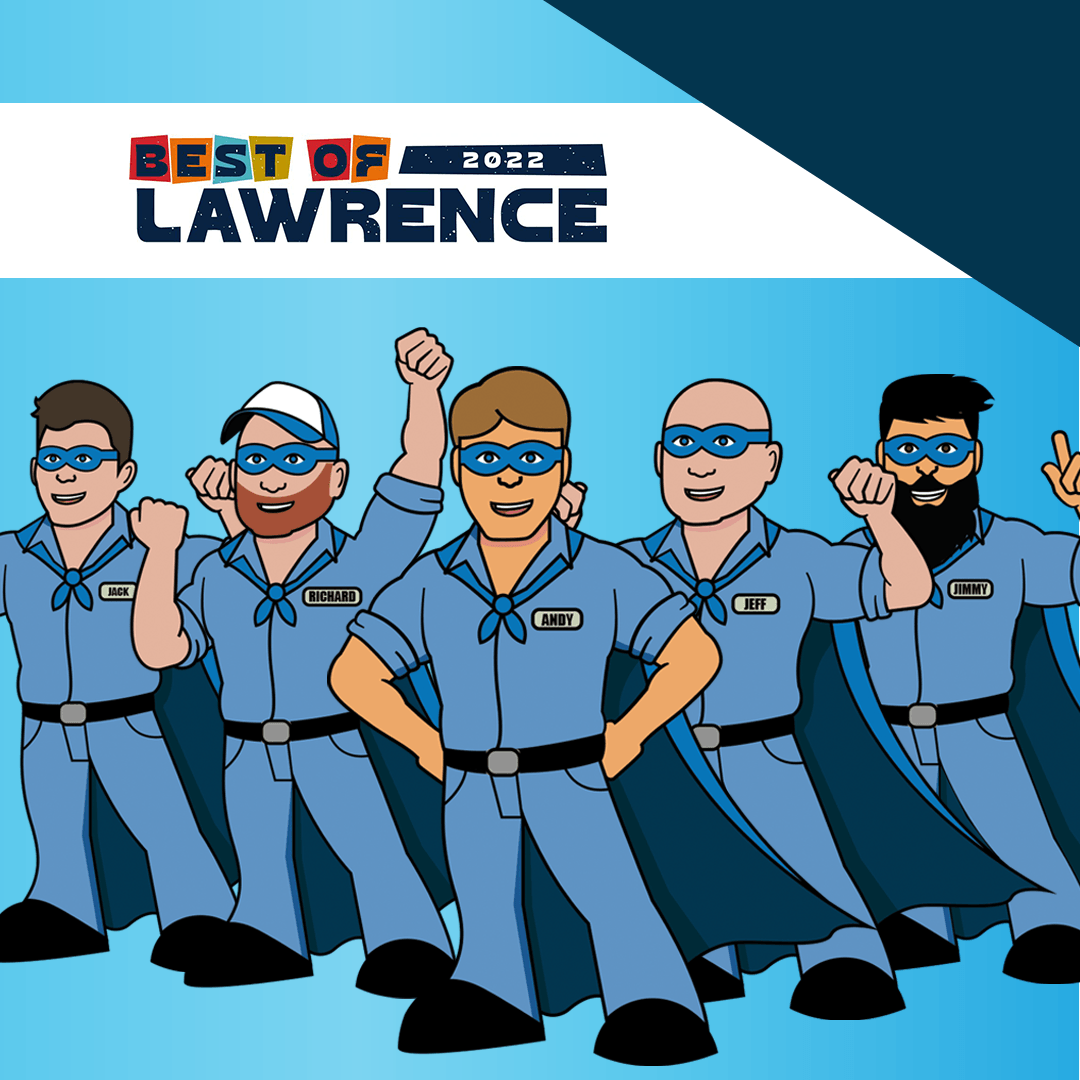
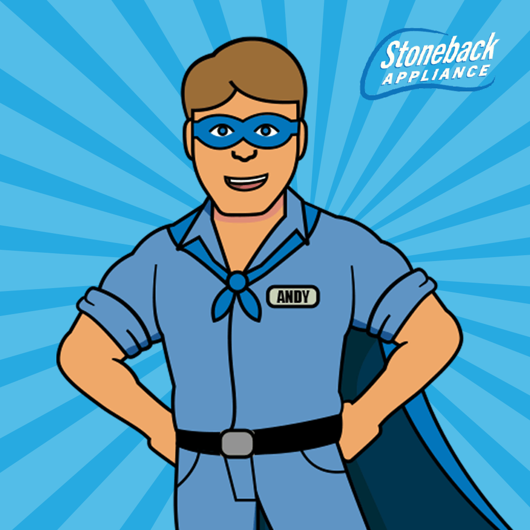
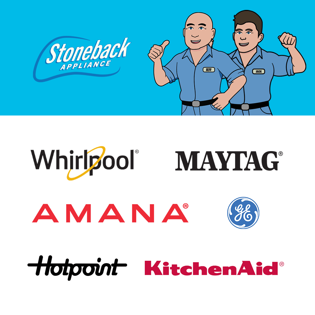
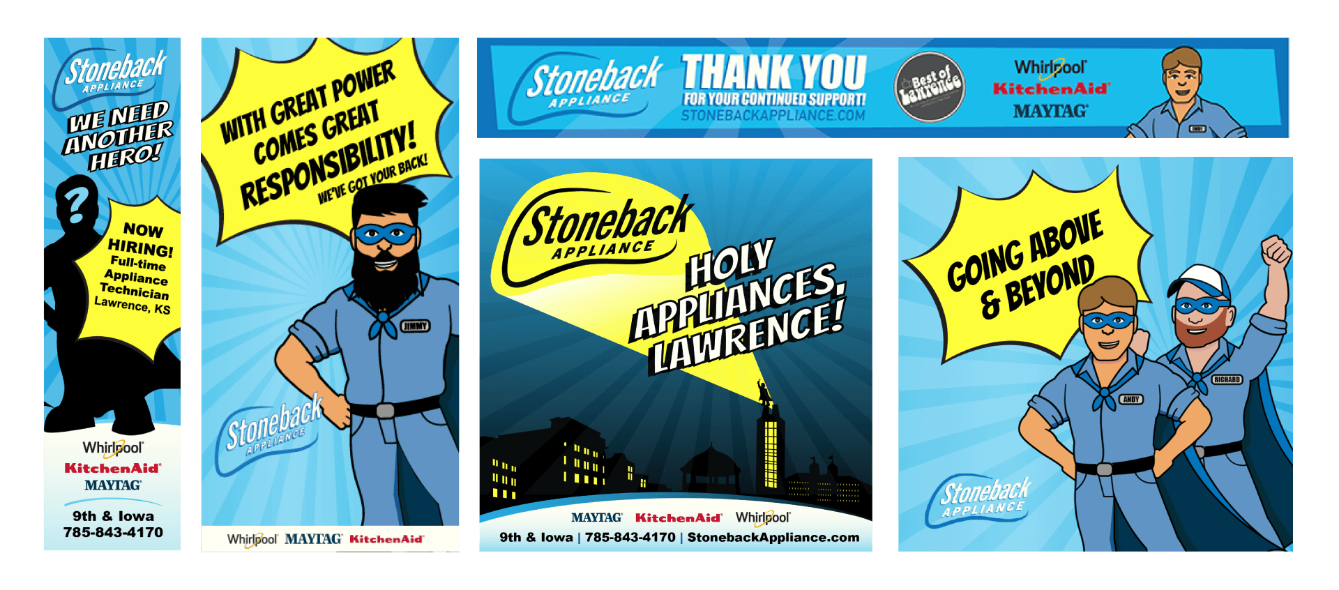
CAMPAIGNS – HOMETOWN HEROES
Our Hometown Heroes campaign uses an illustrated approach of actual Stoneback employees, positioning them with integrity and ready to serve. In this way, customers recognize their service people, whether at the store or when they come to people's homes. Adding capes and superhero poses adds a touch of whimsy for a memorable campaign that fosters a feeling of familiarity and trust for Stoneback Appliance.


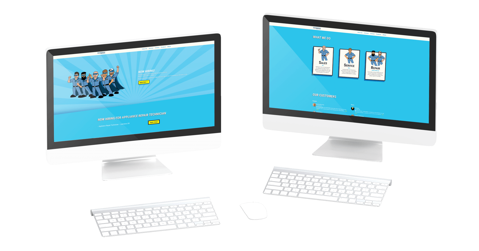
DIGITAL STRATGEY
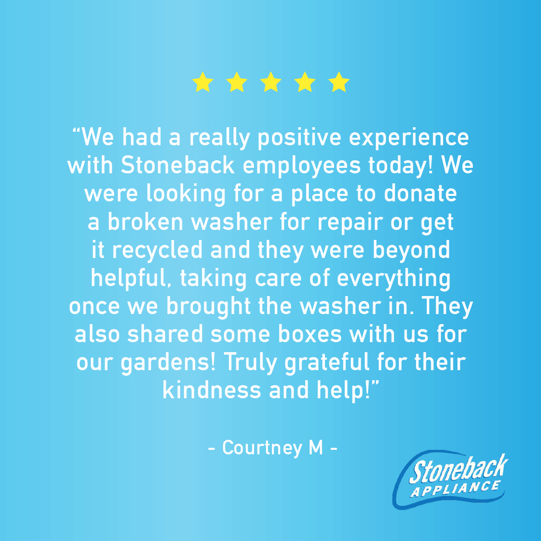
Stoneback Appliance's website redesign carries the brand look forward. Our heroes are front and center. The bright colors are inviting and engaging. The site is simple and easy to navigate, with excellent customer reviews right on the home page and an easy way for clients to connect with Stoneback.

THE RESULTS
Stoneback appliance has enjoyed excellent results from their KMG rebrand and ongoing campaign efforts, both in terms of customer engagement and brand recognition in the community.
Whether you need logo design, campaign development, online ads, web design, marketing strategy, photography – or the whole shebang – KMG will help you reach your target.
KERN, INC.
Unique Entity ID: DJ2TYMD17LL1 | CAGE/NCAGE: 532B8