
TRICENTURY BANK
BRAND IDENTITY
The three triangles of the TriCentury wordmark represent each century that the bank has existed in. Triangles are a symbol of stability, and the unified pyramid is a symbol of action, representing TriCentury's ability to build on its strengths, with an eye on the future. The color green represents growth and while the yellow represents optimism and clarity.
Before
After
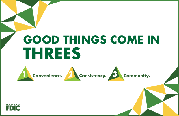
CAMPAIGN – GOOD THINGS COME IN THREES
Continuing with the theme of three, we established a versatile campaign that allows TriCentury to build brand recognition while highlighting their offerings to customers.


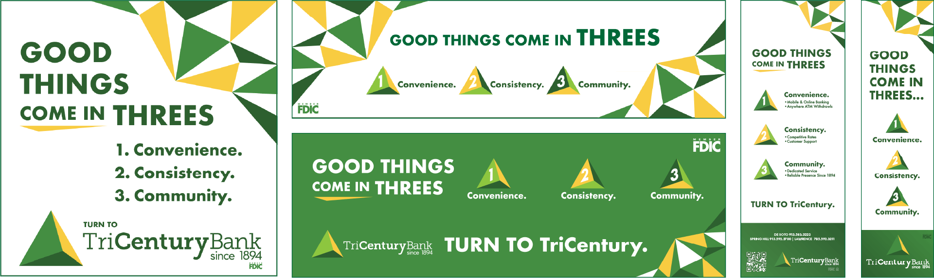
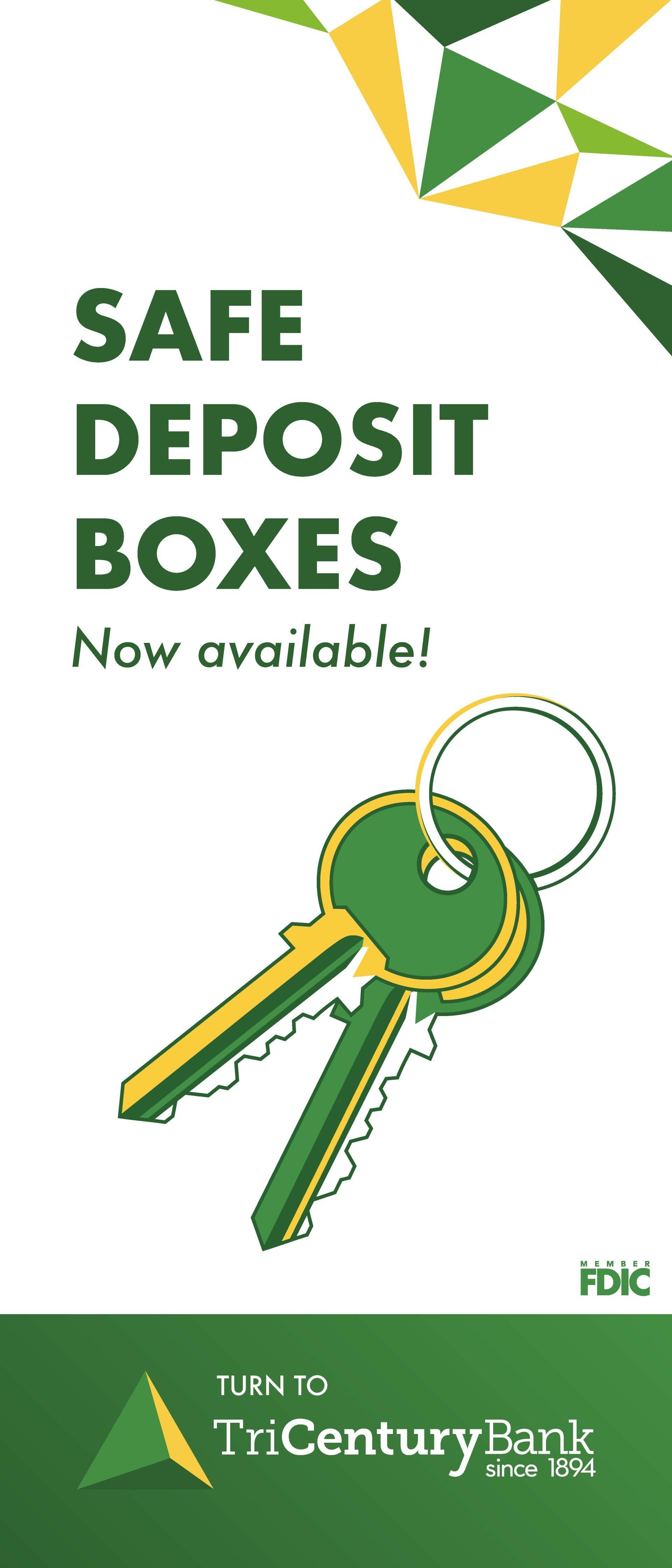
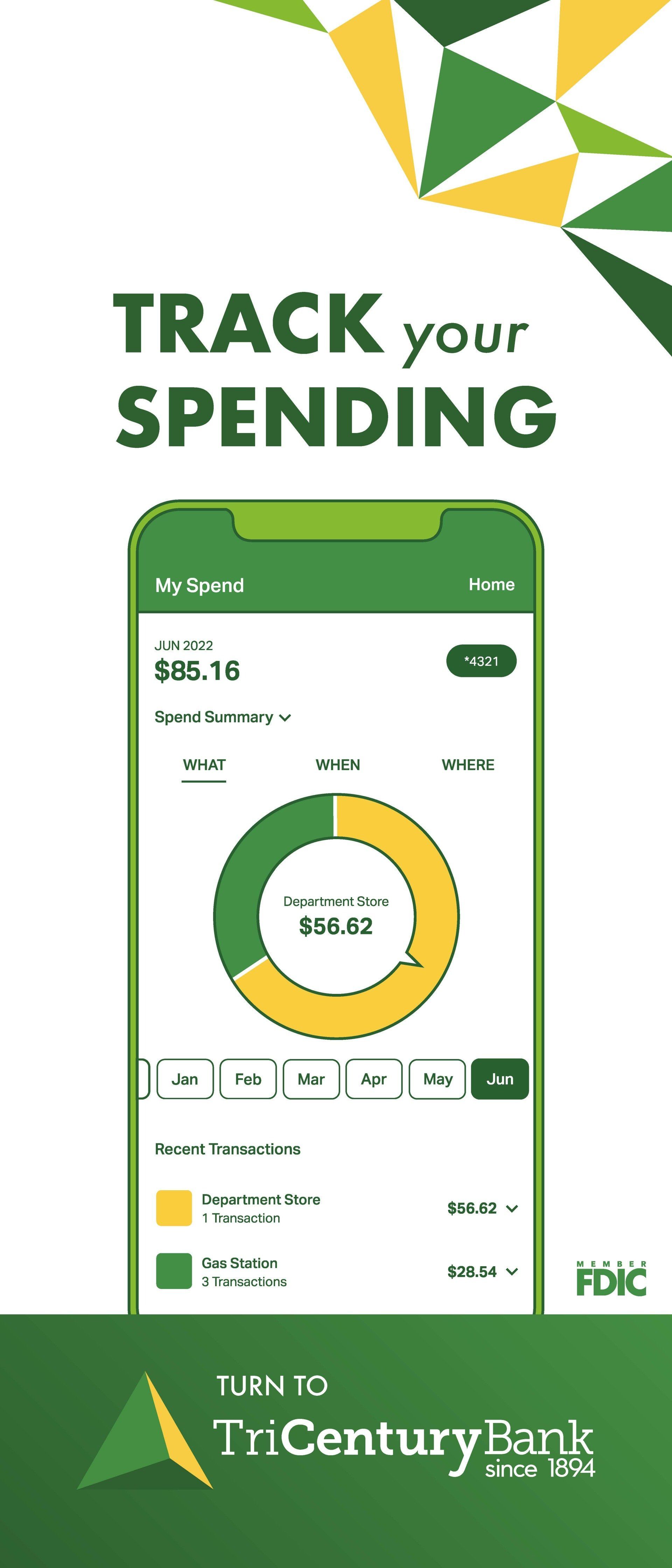
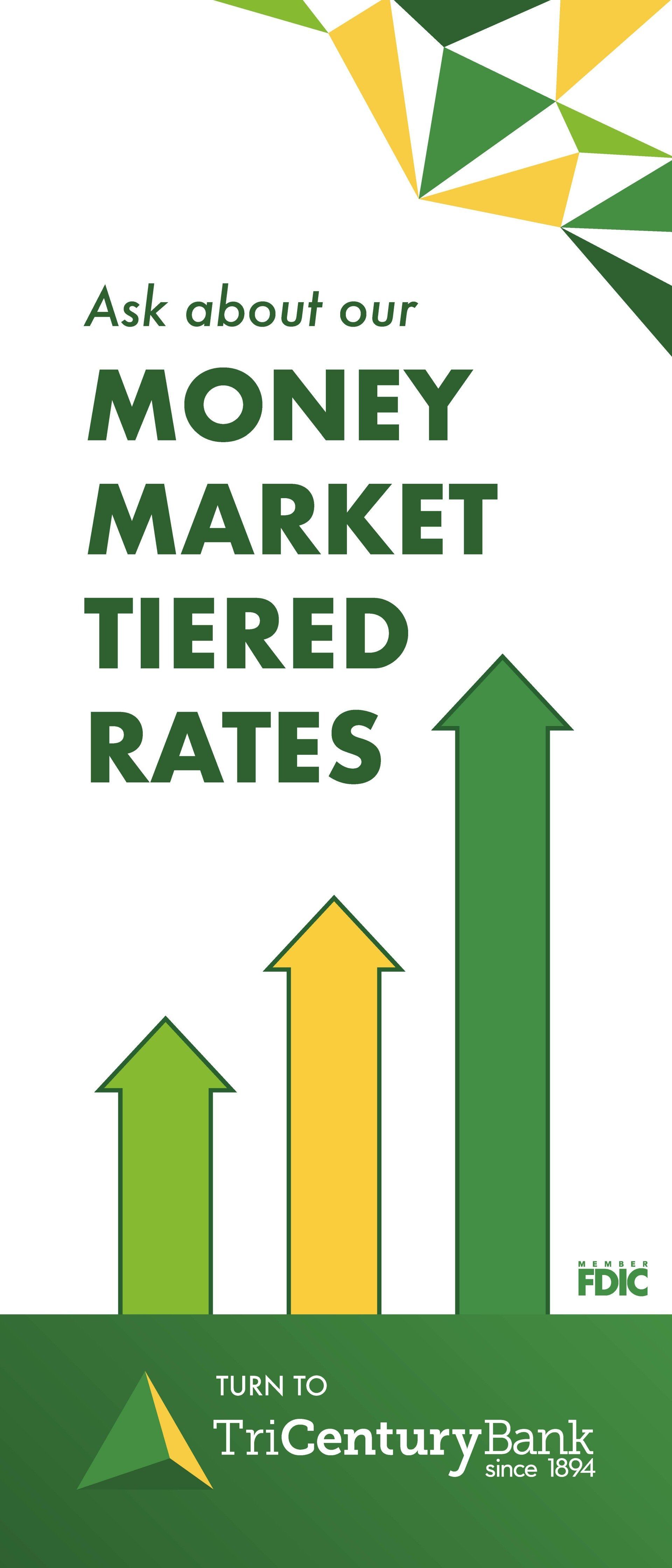

STRATEGY + SOLUTION: TURN TO TRICENTURY
The "Turn to TriCentury" tagline, gives customers a built-in call to action, as well as a reminder that TriCentury supports all banking needs. As a play on "Turn of the Century," the phrase has a feeling of familiarity and a memorable tie-in with the bank's name.
Whether you need logo design, campaign development, online ads, web design, marketing strategy, photography – or the whole shebang – KMG will help you reach your target.
KERN, INC.
Unique Entity ID: DJ2TYMD17LL1 | CAGE/NCAGE: 532B8